Marketing website for CamPulse

Role
UI/UX Designer
Scope
Website Design
Category
B2B Marketing Website
Industry
Enterprise Security & Video Surveillance
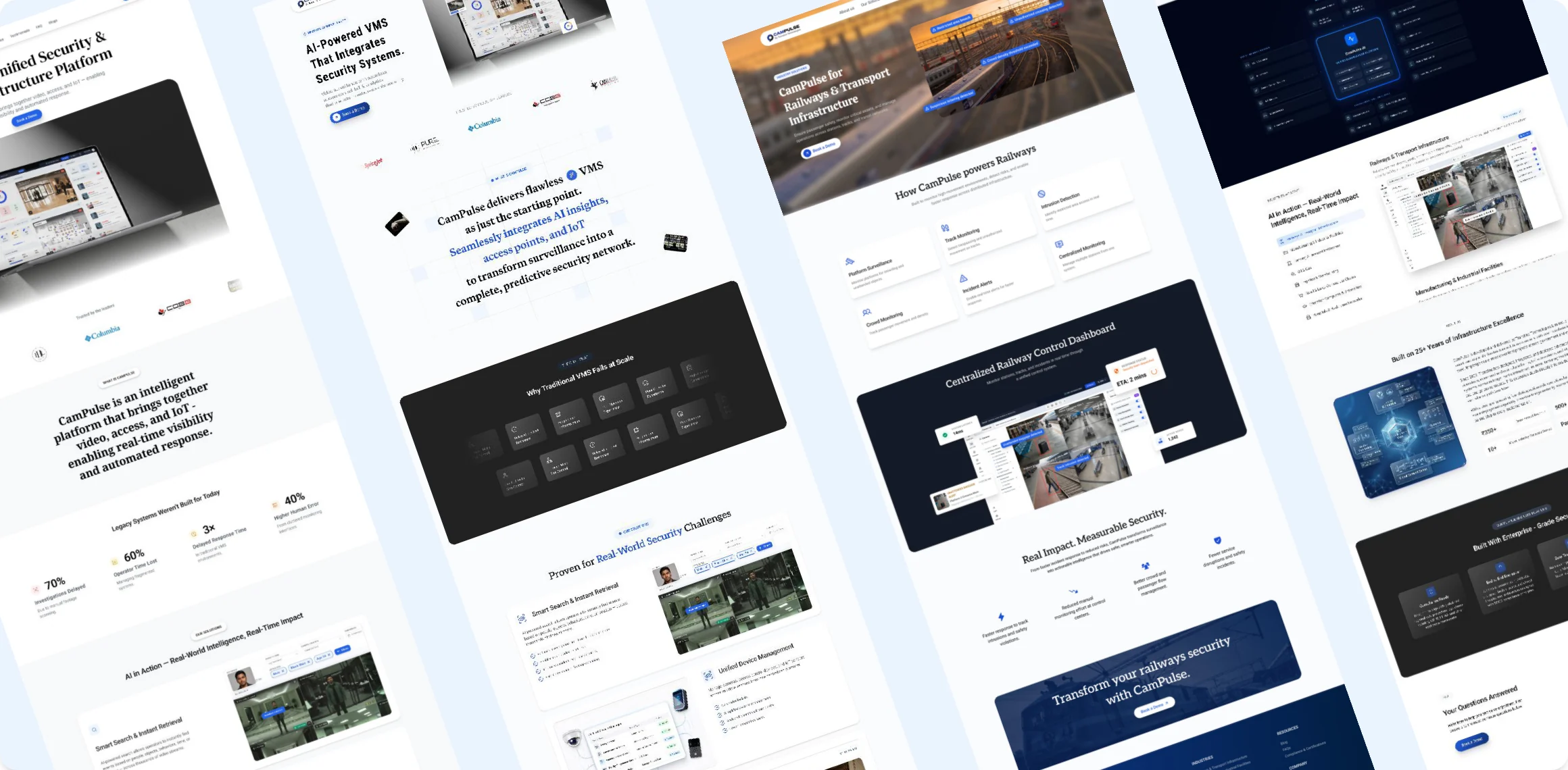
CamPulse marketing website shown across two screens

1. The Brief

CamPulse is a new AI-powered Video Management System (VMS) developed by Transline Technologies. It unifies 1,000+ camera streams, access control systems, and IoT sensors into a single dashboard.

Because CamPulse was a brand-new product, it had zero web presence. The sales team was relying on static slide decks to pitch to high-stakes buyers.

The Goal: Build the entire website from scratch - creating a modern, high-trust digital presence that explains a complex B2B product in seconds and drives qualified demo requests.

2. The Challenge

  • No Historical Data or Content

    There were no past analytics, existing user flows, or ready-made marketing copy. Everything had to be structured from scratch.

  • High Credibility Barrier

    B2B buyers don't easily trust new software with their physical security. The website needed to look established, secure, and enterprise-grade on day one.

  • Translating Engineering into Value

    The core engineering team spoke in heavy technical jargons (IP protocol, VDM orchestration, RTSP streams). I needed to translate these complex features into clear business outcomes.

3. Research

Since we didn't have existing site analytics, I analyzed top enterprise SaaS and infrastructure landing pages, then spoke with our sales team to map out what buyers care about most.

Legacy competitor weakness
CamPulse opportunity
Our web strategy
Lots of text descriptions, zero product previews
Buyers want to see the software before booking a demo
Show real product screenshots as users scroll
Hidden rules forcing buyers to use specific camera brands
CamPulse works with any existing camera brand – giving us a huge advantage
Dedicated ecosystem visualiser aimed at IT directors
Generic, one-size-fits-all pitch for every client
Different industries care about totally different security threats
Clickable tabs showing custom features for each industry
New-brand trust gap, no case studies at launch
Parent company holds ISO 27001 & CMMI Level 5 credibility
Highlight Transline Technologies' track record to build brand trust

4. Ideas and Iterations

I tested multiple layouts to strike the right balance between technical depth and effortless scannability. Incorporating feedback from sales and engineering team helped transform early, text-heavy drafts into a crisp, high-converting visual experience.

Early layout explorations for the CamPulse marketing site

5. Key Design Decisions

I combined enterprise SaaS research with direct sales insights to curate high-impact sections that drive conversion.

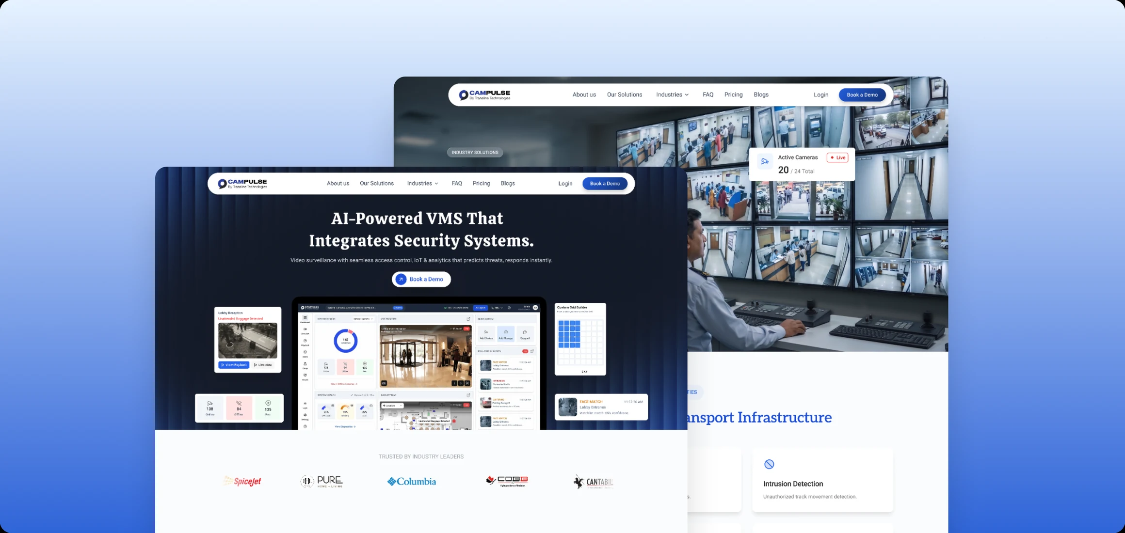
Hero Section with Product Preview

Placing a crisp, high-fidelity snippet of the software interface directly inside the landing page hero section creates instant visual contrast. It establishes product transparency right away without forcing users to scroll to see the product.
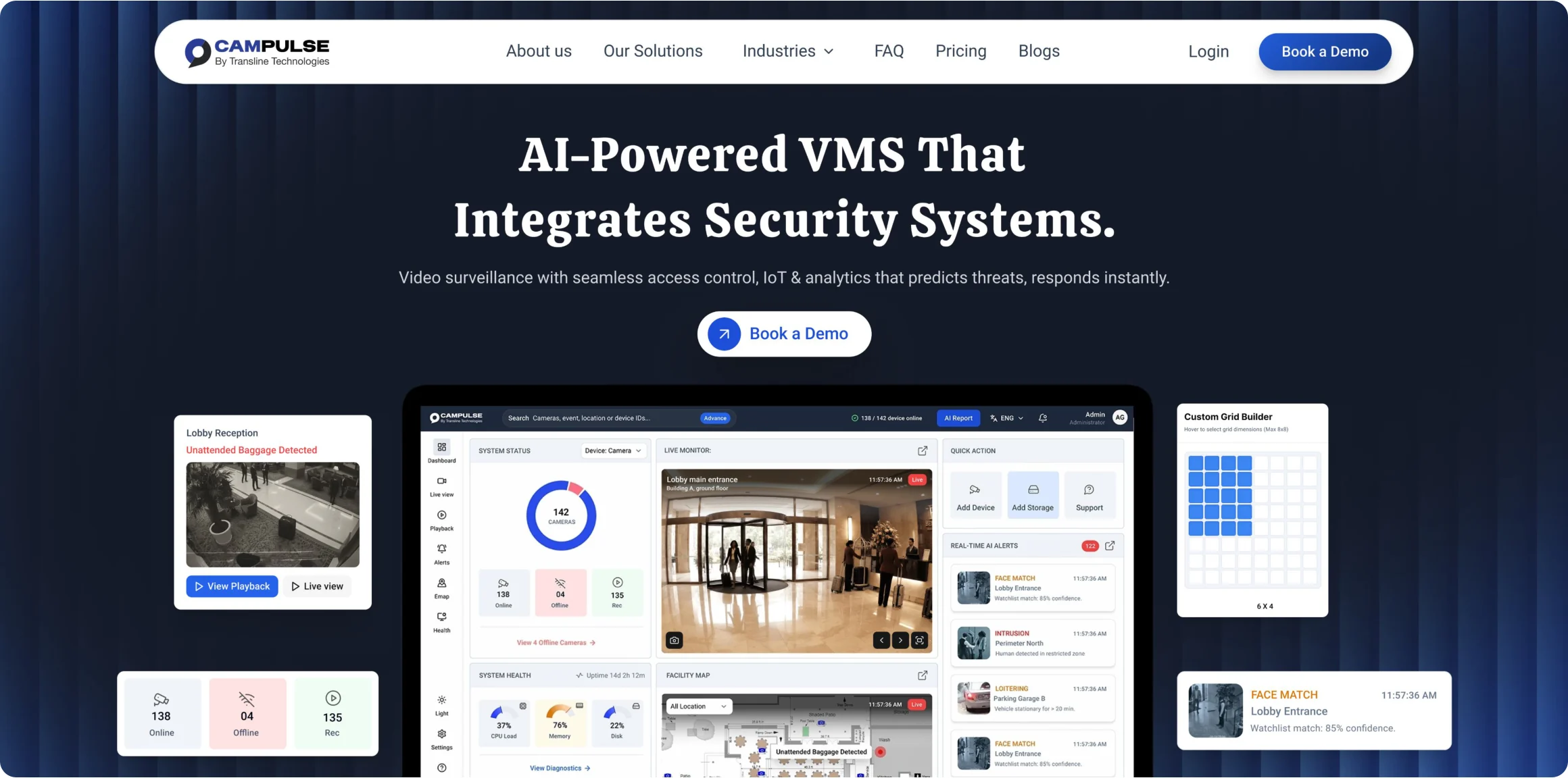
CamPulse landing page hero with the product dashboard on screen

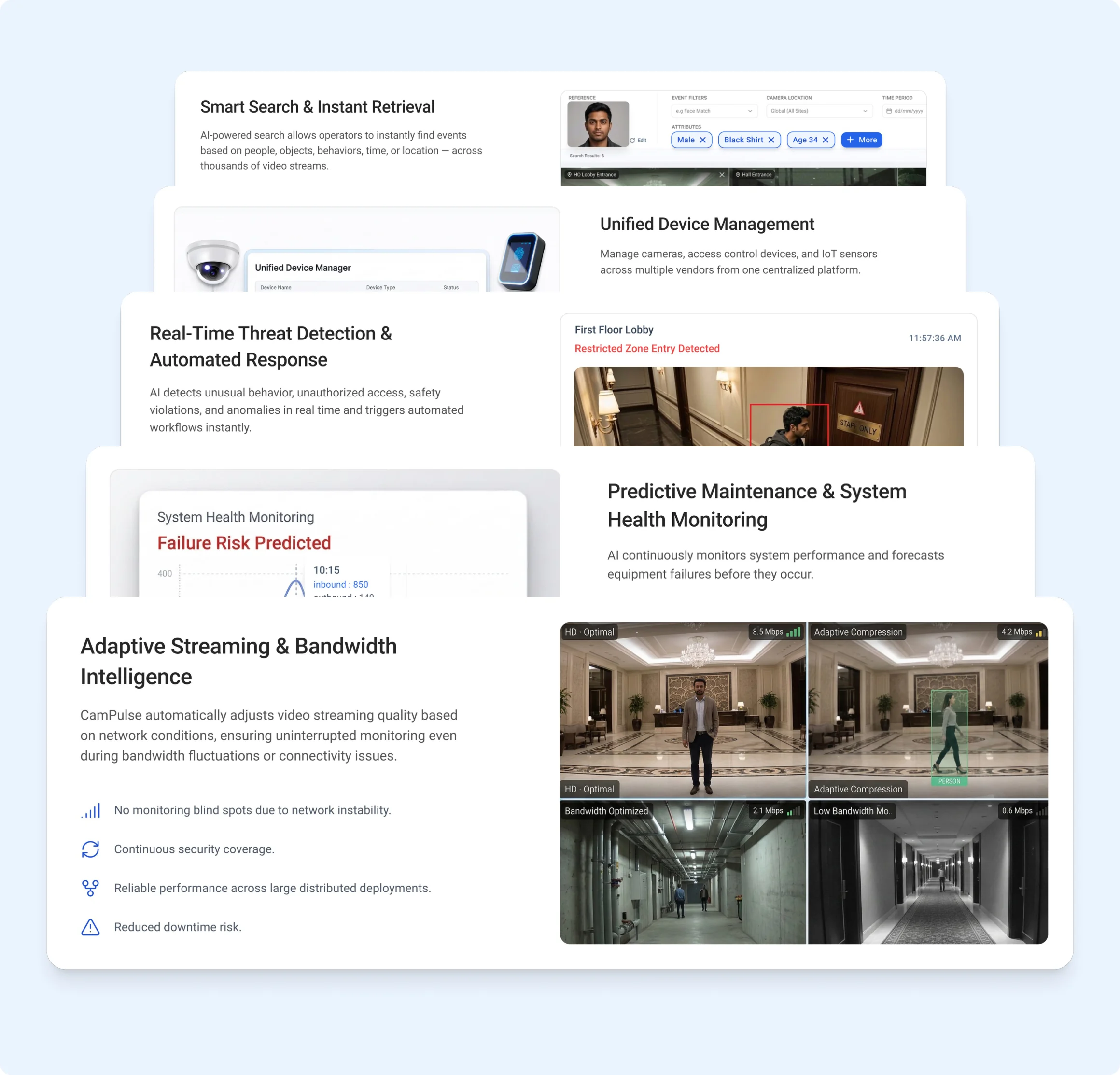
Proven for Real-World Security Challenges
Feature Cards Grid

Each feature card combines concise copy with a micro-UI screenshot of the product in action (e.g., showing the actual search bar and threat notification cards). It lets buyers scan capabilities visually in under 5 seconds.

Staggered feature cards, each paired with a micro-UI screenshot

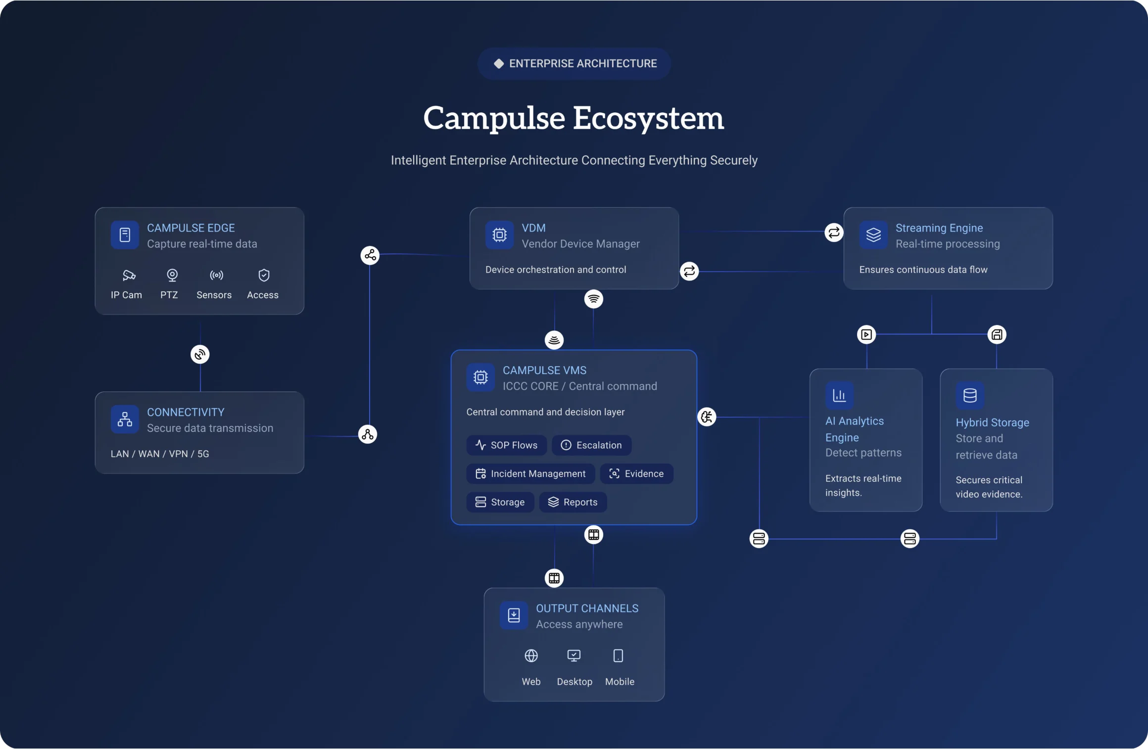
"CamPulse Ecosystem" Architecture Diagram

This section translates complex engineering into a clean, scannable flow diagram. It visually proves seamless integration across IP cameras, PTZ devices, IoT sensors, and network setups.

CamPulse ecosystem architecture diagram

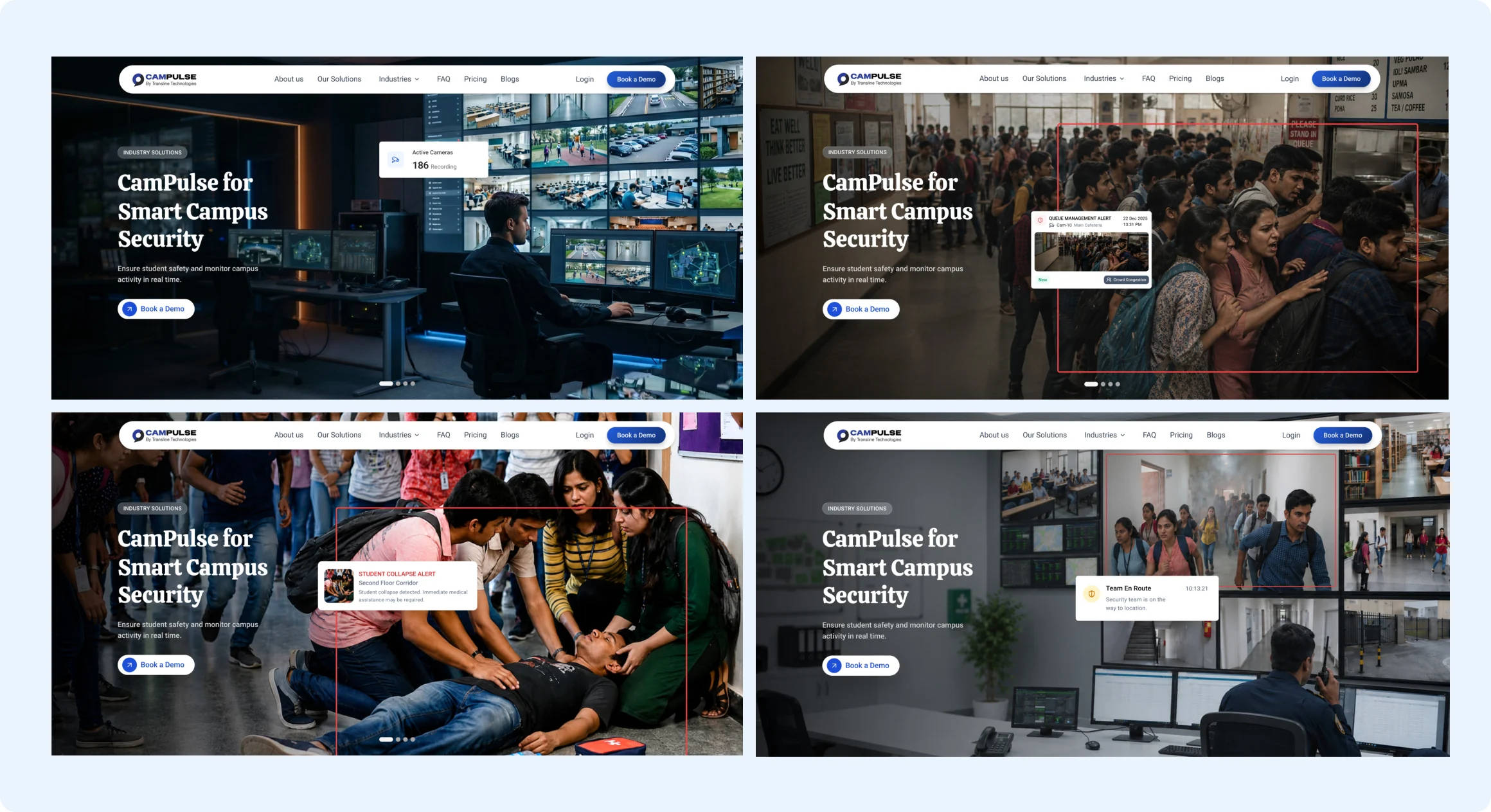
4-image use case carousel in
Industry specific pages

Tailored the hero carousel in Industry pages to showcase campus-specific scenarios—including student safety alerts, overcrowding, and unauthorized access—rather than generic product features. This helps university decision-makers immediately visualize the platform's value within seconds of landing on the page.

Four hero carousel frames for the smart campus industry page

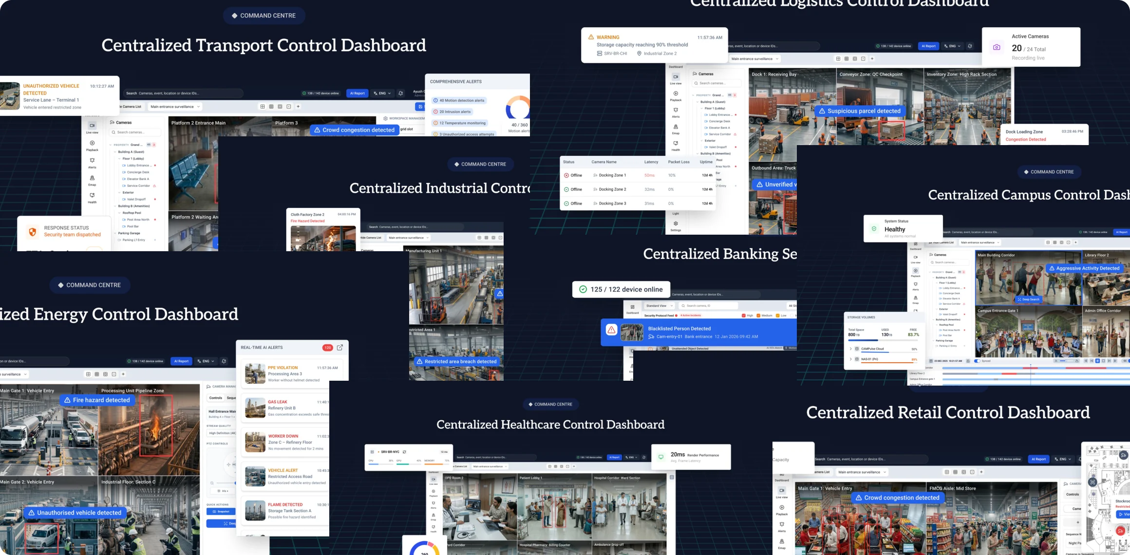
Industry Product Mockup section
showing the software

Displayed specialized UI dashboards across key verticals to show how the software handles industry-specific workflows. Providing realistic product previews helps decision-makers evaluate interface usability and feature relevance before booking a demo.

Control dashboards mocked up for transport, energy, retail, banking and healthcare

6. Impact & Results

Building this 0-to-1 website helped turn a complex AI product into an easy-to-understand experience that drives sales.

Better Sales Conversations

Replaced static slide decks with a visual, interactive landing page that sales people can walk buyers through live.

Frictionless Lead Flow

Placing "Book a Demo" buttons at logical stopping points made it simple for visitors to request a walkthrough.

Reduced Cognitive Load

Showing real app screenshots directly on the site answered "what does it look like?" instantly, saving buyers time and building early trust.

Clearer Industry Context

Industry-specific pages (like Transport & Railways) helped buyers immediately see how the software solves their exact problems.

7. Lessons Learned & Next Steps

Building this 0-to-1 website helped turn a complex AI product into an easy-to-understand experience that drives sales.

Lessons Learned

  • Content Strategy First:

    Designing a 0-to-1 website for a complex product proved that information architecture and copy hierarchy matter just as much as visual UI.

  • B2B Buyers Need Visual Proof:

    Abstract tech claims don't convert; showing realistic, industry-specific dashboard previews builds immediate trust with technical gatekeepers.

Next Steps

  • Post-Launch Analytics:

    Track drop-off rates on the "Book a Demo" CTA using Clarity/Hotjar heatmaps.

  • A/B Testing:

    Experiment with alternate hero headlines to optimize conversion for high-volume industries like Manufacturing and Logistics.