HR Managers Need "Today's Priorities" First
Clients didn't want to dig through complex monthly reports just to see who was late or on leave today. They needed immediate, top-of-page visibility into daily workforce status.
 RITIKA SHARMA
View Resume ↗
RITIKA SHARMA
View Resume ↗
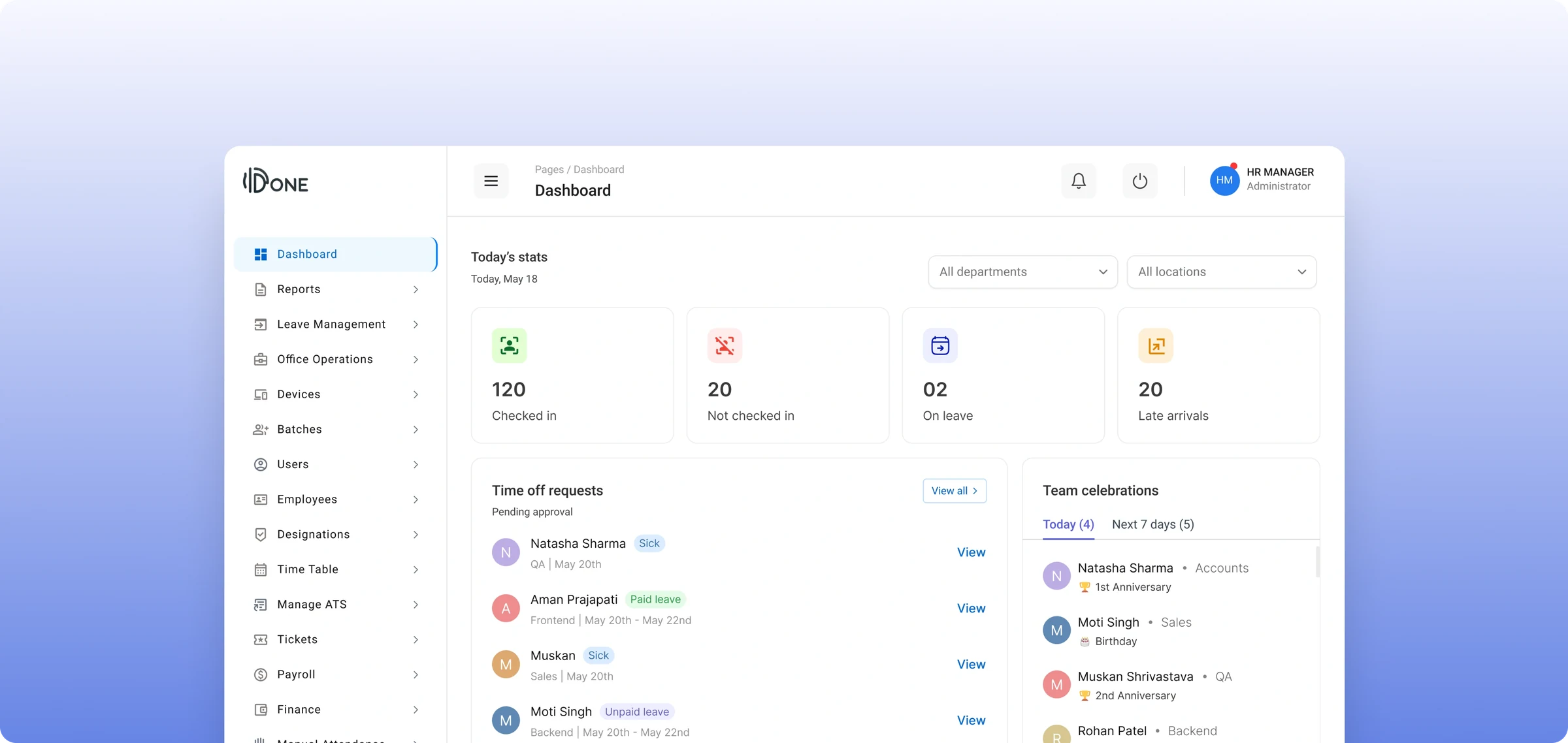
IDone is an enterprise HRMS (Human Resource Management System) designed to simplify workforce operations, attendance tracking, leave requests, and payroll for organizations.
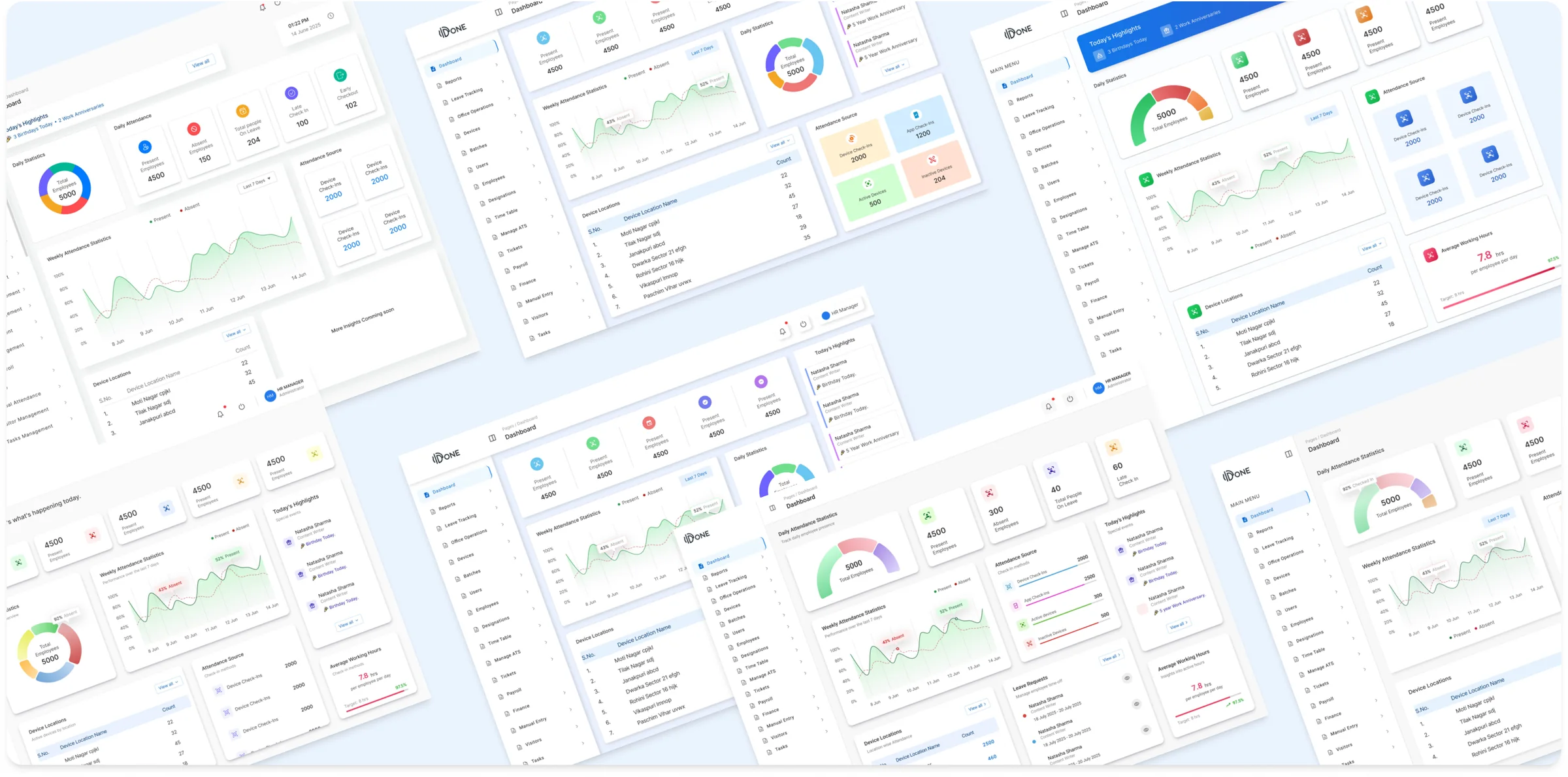
To support large companies with thousands of employees across multiple office branches, iDone needed to replace its old dashboard with a modern, clear interface that gives HR managers instant visibility into daily operations.
The Goal: Redesign the legacy HRMS dashboard into a scalable, data-driven workspace that gives HR managers real-time operational visibility and multi-location data control.
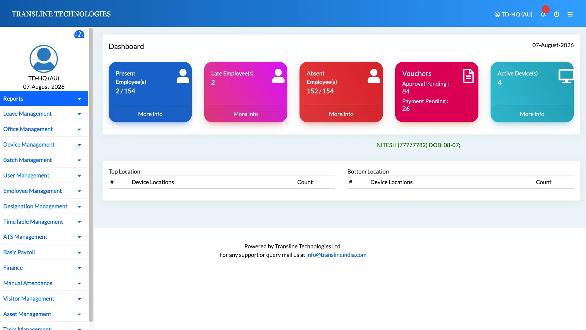
Couldn't support custom client needs or modern interactive components.
Harsh, high-contrast gradients caused visual strain and looked unprofessional.
Key updates like employee birthdays were buried in tiny, unreadable text.
Showed only basic device counts, hiding leave approvals, trends, and calendars.
Lacked location and department filters, mixing all multi-branch data together.
To understand what enterprise clients actually needed from a daily HRMS dashboard, I conducted internal stakeholder sessions with product managers and analyzed recurring client feature requests.
Clients didn't want to dig through complex monthly reports just to see who was late or on leave today. They needed immediate, top-of-page visibility into daily workforce status.
Enterprise clients with offices in multiple cities were frustrated that they couldn't filter attendance or devices by specific office locations or departments.
Approving leave requests and checking employee celebrations (birthdays/anniversaries) are daily routines. Hiding them inside sub-menus slowed down HR workflows.
I studied modern B2B SaaS dashboards for layout inspiration, then iterated through multiple wireframe concepts to balance high-level daily KPIs with detailed attendance charts without cluttering the screen.
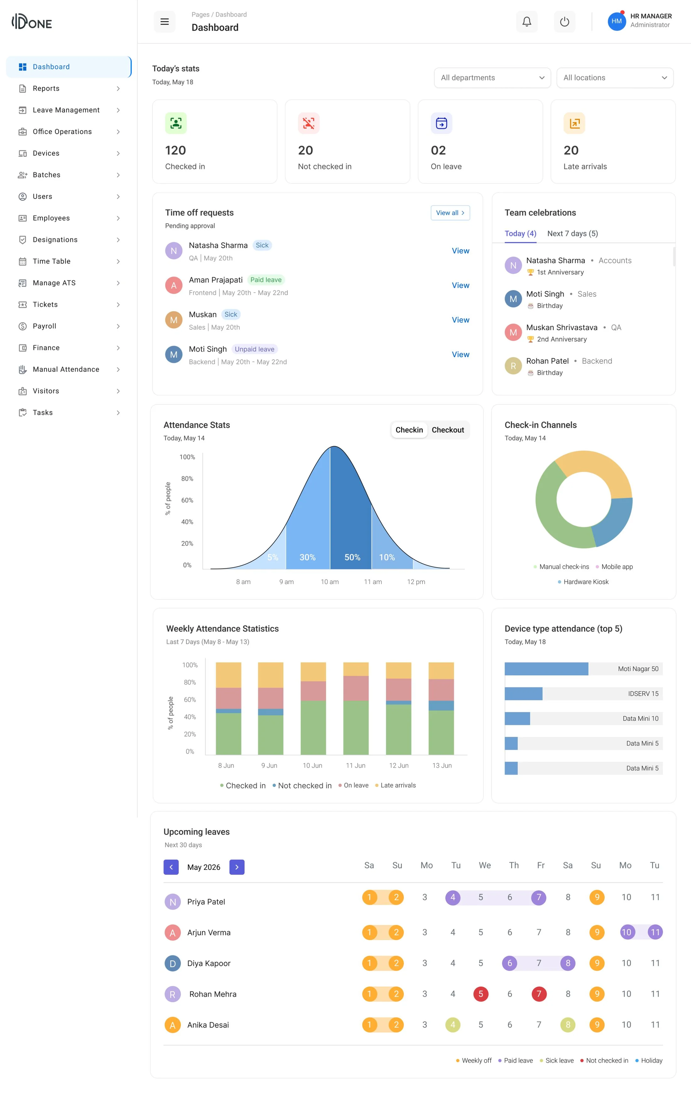
Placed 4 core metrics (Checked in, Not checked in, On leave, Late arrivals) at the top alongside global Department and Location filters.
Gives admins a 2-second snapshot of todays workforce while enabling instant branch-level data filtering.
Built side-by-side modules for Time off requests (with direct "View" actions) and Team celebrations tracking birthdays and work anniversaries across Today and Next 7 days.
Helps managers take quick action on leave requests and team birthdays right from the main screen.
Combined hourly Attendance Stats, a Check-in Channels donut chart, a Weekly Attendance bar chart, and a Top 5 Device Types breakdown.
Replaces raw text logs with clear visual charts, allowing managers to spot attendance trends and monitor device usage effortlessly.
Added a color-coded monthly timeline widget mapping future employee leaves (Weekly off, Paid leave, Sick leave, Holidays).
Gives department leads forward-looking visibility to plan shift coverages and project deadlines with ease.
| Category | Old dashboard | Redesigned dashboard |
|---|---|---|
| Data Structure & Filters | Flat, single-view layout with no filtering options | Global Location and Department filters |
| Visual Style | Heavy gradient cards with poor contrast & text hierarchy | Clean metric cards with scannable numbers & status icons |
| Workflow Speed | Required 3–4 clicks through sub-menus to approve leaves | Direct Time Off Requests widget with 1-click view/approve |
| Data & Charts | Raw, unorganized number counts | Weekly Attendance Trends & Top Device Type cards |
| Team Milestones | Single scrolling text banner | Dedicated Team Celebrations card (Birthdays & Anniversaries) |
Measurable improvements were seen in task completion speed, data usability, and system scalability following the redesign.
HR admins can now seamlessly isolate data for specific branches and teams in real time.
Surfacing pending requests directly on the home screen eliminated sub-menu navigation and reduced approval turnaround times.
Designed a flexible UI component grid that accommodates future enterprise features without cluttering the screen.
When working with legacy systems, UX design isn't just about making things look modern—it's about restructuring information architecture so new features fit into existing system capabilities.
Enterprise users don't want complex decorative graphics; they want immediate clarity on what needs their attention today (who is absent, whose leave is pending, which device is offline).